Official Voter Registration Website
- Role
- UI Design & Prototyping
- Type
- Government Web Application
- Result
- Service is live and still in use today
Overview
Designing the official voter registration website for Puerto Rico meant accessibility was key: no voter could be left behind. My challenge was to take a dense, complex set of government requirements and turn them into something every citizen could navigate with confidence.
The problem
Transforming complex requirements into a simple experience
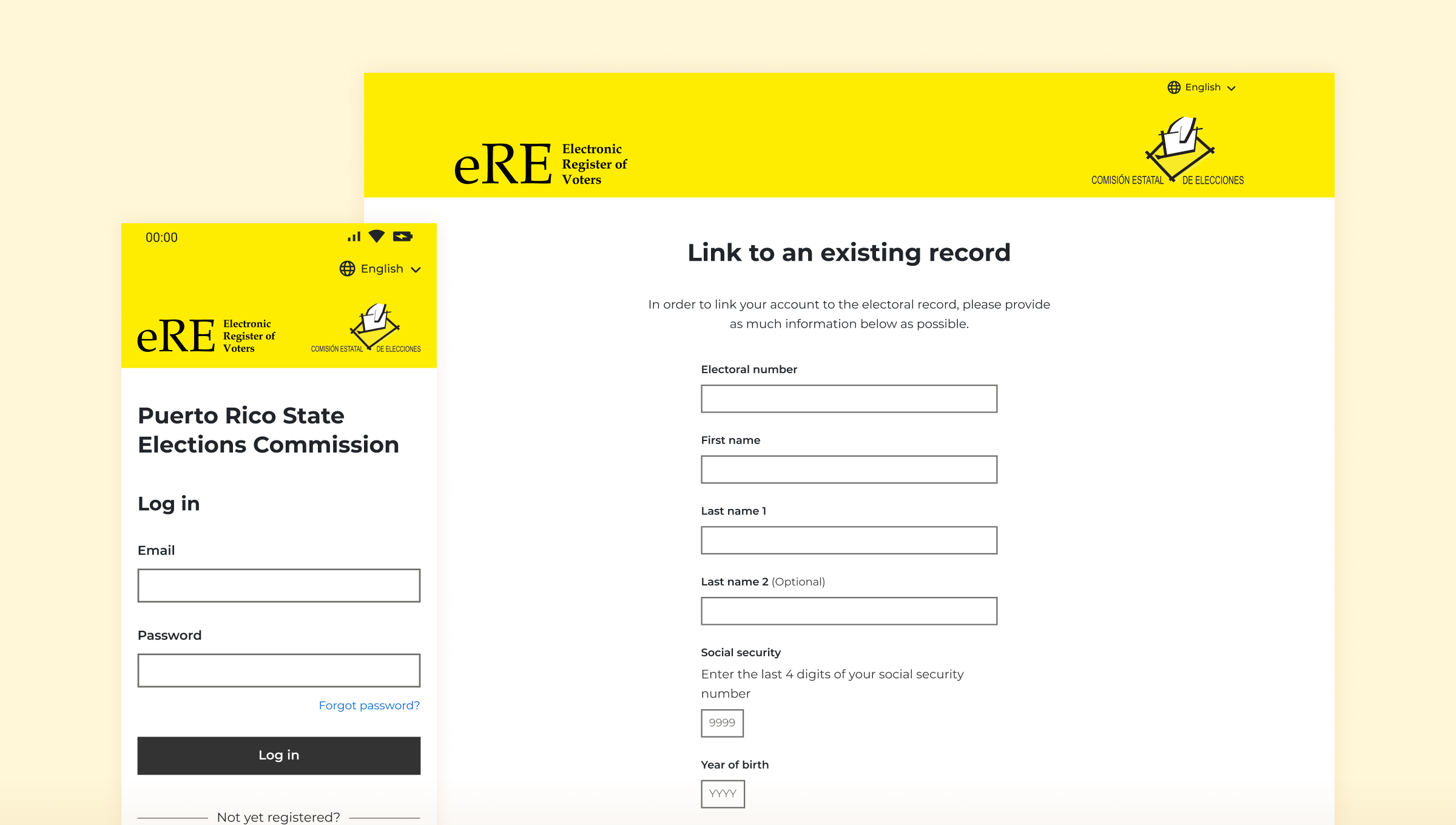
I was commissioned to design the official voter registration website for elections in Puerto Rico. A detailed set of government specifications had already been defined, covering the various pages of the registration form and a user account area. My challenge was to convert them into something that’s simple and easy to use, whilst working within the confinements of the specifications.
Considering the accessibility was fundamental to this project. The form had to work for everyone, across all ages, devices, and levels of digital confidence.
My approach
Bringing the specifications to life
With the requirements already defined, I began with a thorough analysis of the specifications to fully understand what was needed before touching any designs. From there I built out the component system first, establishing high contrast colours and an accessible UI kit before assembling the screens. Once all screens were complete, I produced a fully interactive Figma prototype to demonstrate the entire registration journey end to end.
01
Requirements analysis
Reviewing the specifications to understand the entire flow
02
Component design
Building an accessible UI kit
03
Screen design
High-fidelity designs for each step of the registration flow across all breakpoints
04
Prototyping
Creating a fully interactive Figma prototype to demonstrate the entire flow
Accessibility
Inclusive design
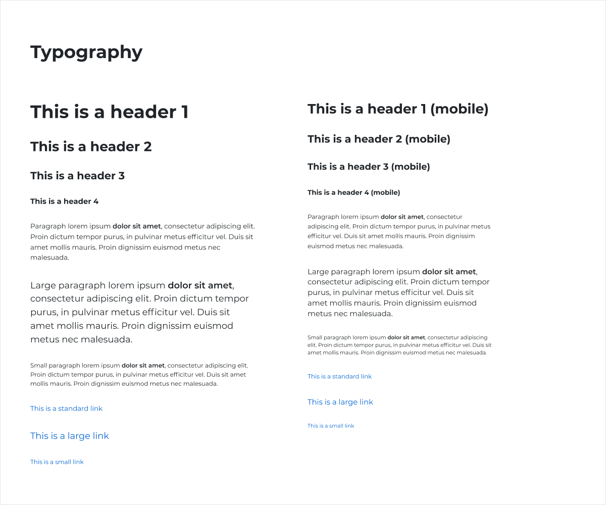
Accessibility was the driving factor behind every decision. The website had to be usable by every eligible voter, regardless of age, device, or ability. That meant keeping the colour scheme simple and high-contrast, choosing typography for legibility over personality, and taking inspiration from the UK Government Design System, one of the design systems I tend to look to when accessibility is a priority.
The designs were fully responsive, ensuring the experience held up equally well across desktop, tablet, and mobile, which is particularly important given the trend towards being able to complete important tasks from just your phone.
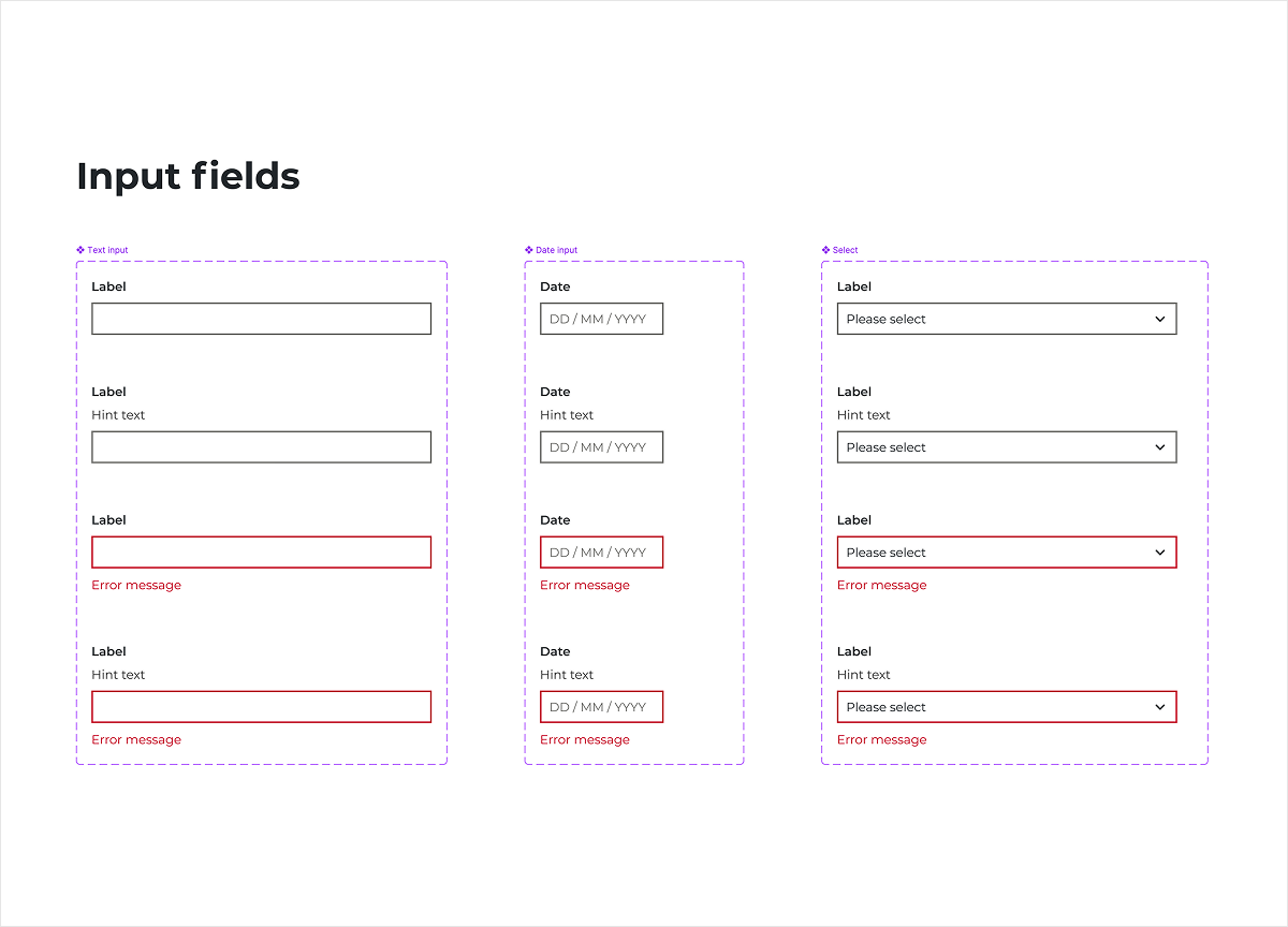
UI library
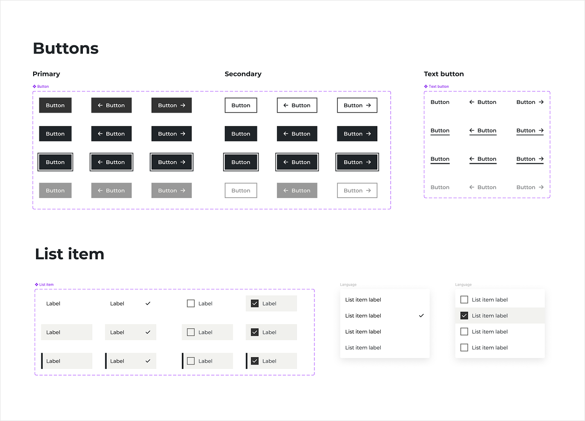
Starting with the components
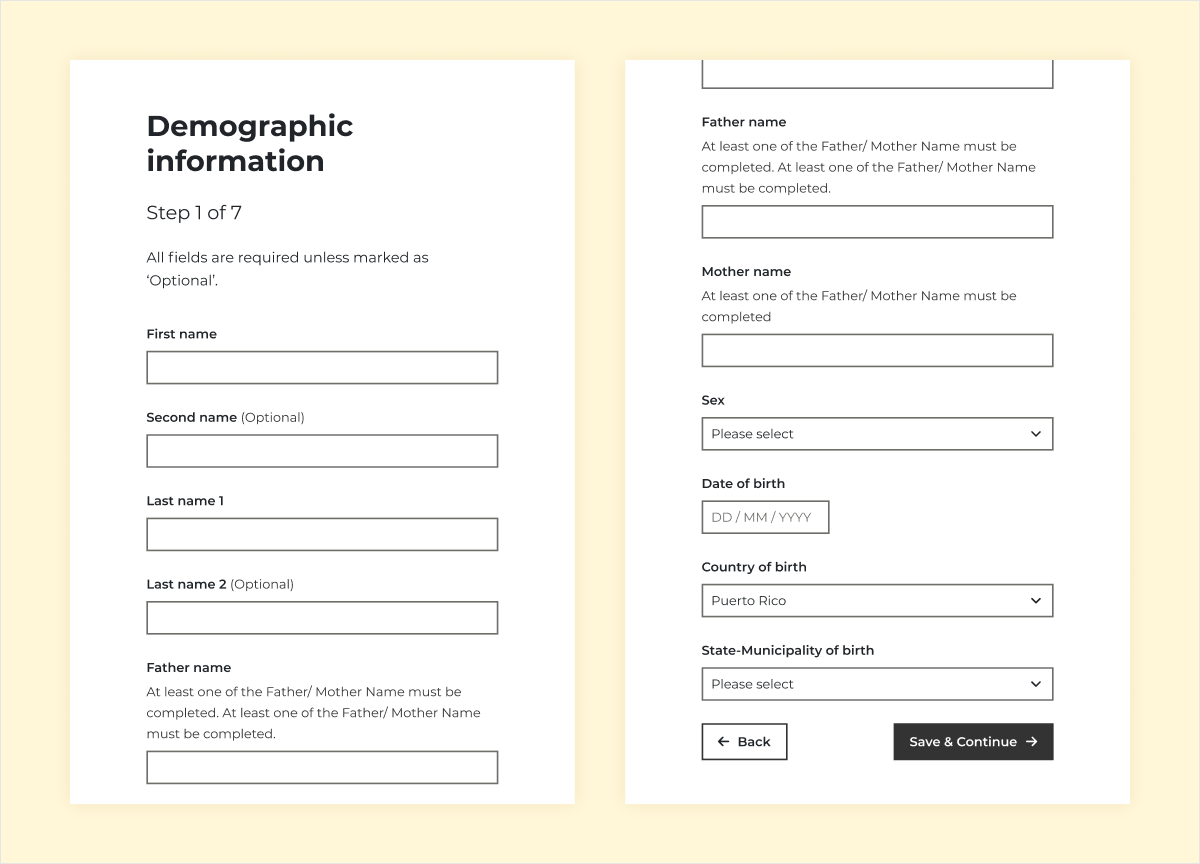
At its core, the voter registration website is a long, complex form. Before designing any screens, I built out the complete set of components and input types that would be needed establishing a consistent, accessible UI system from the ground up. This ensured every element behaved predictably and maintained the same standard of clarity throughout.
A key design challenge
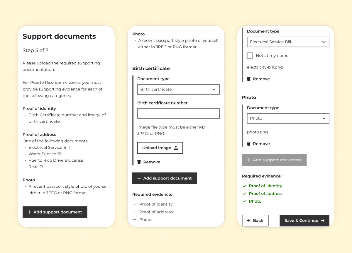
Conditional document uploads
One of the most complex areas of the form was the document upload step. Depending on where the registrant was born, they were required to provide different types of supporting documents, each with its own set of requirements, creating a real risk of confusion.
Presenting every possible document requirement to every user would be overwhelming and potentially misleading, causing the user to have to first decipher which set of requirements applies to them.
My solution was to use information the form had already collected (i.e the country of birth) to only surface the relevant document requirements for that individual. Rather than a long, confusing list of possibilities, each user saw a clear list of the types of document that applied to them.
As each document type was selected, its specific requirements and fields were revealed progressively, ensuring users were never confronted with unnecessary information. A real-time checklist tracked upload progress, and once all the required documents were in place the user was able to move on to the next step, reducing the likelihood of errors.
The outcome
Live, and still in use today
The designs went live and remain in active use as the official voter registration platform for Puerto Rico.
Reflection
This project was delivered under tight timelines, with pre-defined requirements and the development team ready and waiting to start. My focus was on creating clear, consistent UI designs that could be implemented quickly and efficiently.
With more time, I would focus on the design patterns shaping how users progress through the form. The form is quite long which risks overwhelming users or increasing drop-off before completion, so I would have liked to further explore how much information should be presented to the user before continuing to the next section of the form.