Image Grouping Feature for a Brand Protection Platform
- Role
- UX & UI Design
- Type
- Enterprise web application
- Result
- Improved usability with positive feedback from user testing
Overview
This client helps some of the world’s biggest brands — including Microsoft and Nike — identify and remove counterfeit products from the web. Their application included a potentially powerful image grouping feature, however issues with the interface led to it not being used.
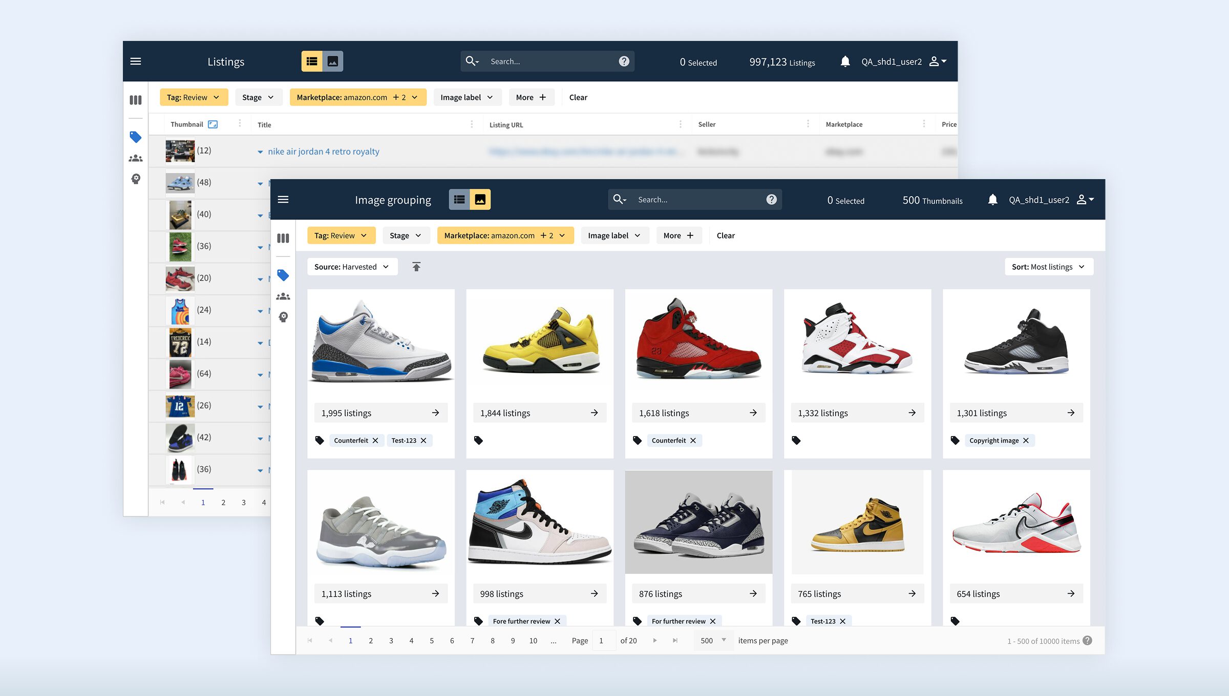
The brief
A powerful feature that wasn't being used
Please note: Some details have been redacted to protect client confidentiality.
The image grouping feature analyses product listings across the web, identifying exact image matches and visually similar images that may represent the same counterfeit product. Staff can then view all listings associated with a particular image, making it far faster to spot and action counterfeits at scale.
The feature had a lot of potential to be one of the most valuable tools in the application, however it was plagued with issues that led most staff to avoid using it. My brief was to identify what was wrong and redesign the feature so that it actually got used.
My approach
Research first, design second
Before proposing any solutions, I needed to fully understand the problem. I began with a holistic review of the existing application and informal conversations with staff, before documenting my findings and sharing them with stakeholders. I then continued to create wireframes, validating them through structured usability testing with the people who use the application every day.
After iterating on the wireframes based on the user interviews and receiving sign-off from the stakeholders, I then continued to create the high-fidelity designs and prototype, focusing on every individual component and the interactions between states and flows, before preparing detailed specifications ready for development.
01
Application review
Holistic UX review and informal staff conversations
02
Findings & Documentation
Documented key areas for improvement and recommendations
03
Wireframing
Creating wireframes to illustrate my proposed solutions
04
User interviews and usability testing
Wireframes validated through structured interviews with users
05
Final designs and prototype
Component based design, and interactive prototype in Figma
06
Design handoff
Creating detailed specifications for development
Holistic review
Navigating the feature was frustrating
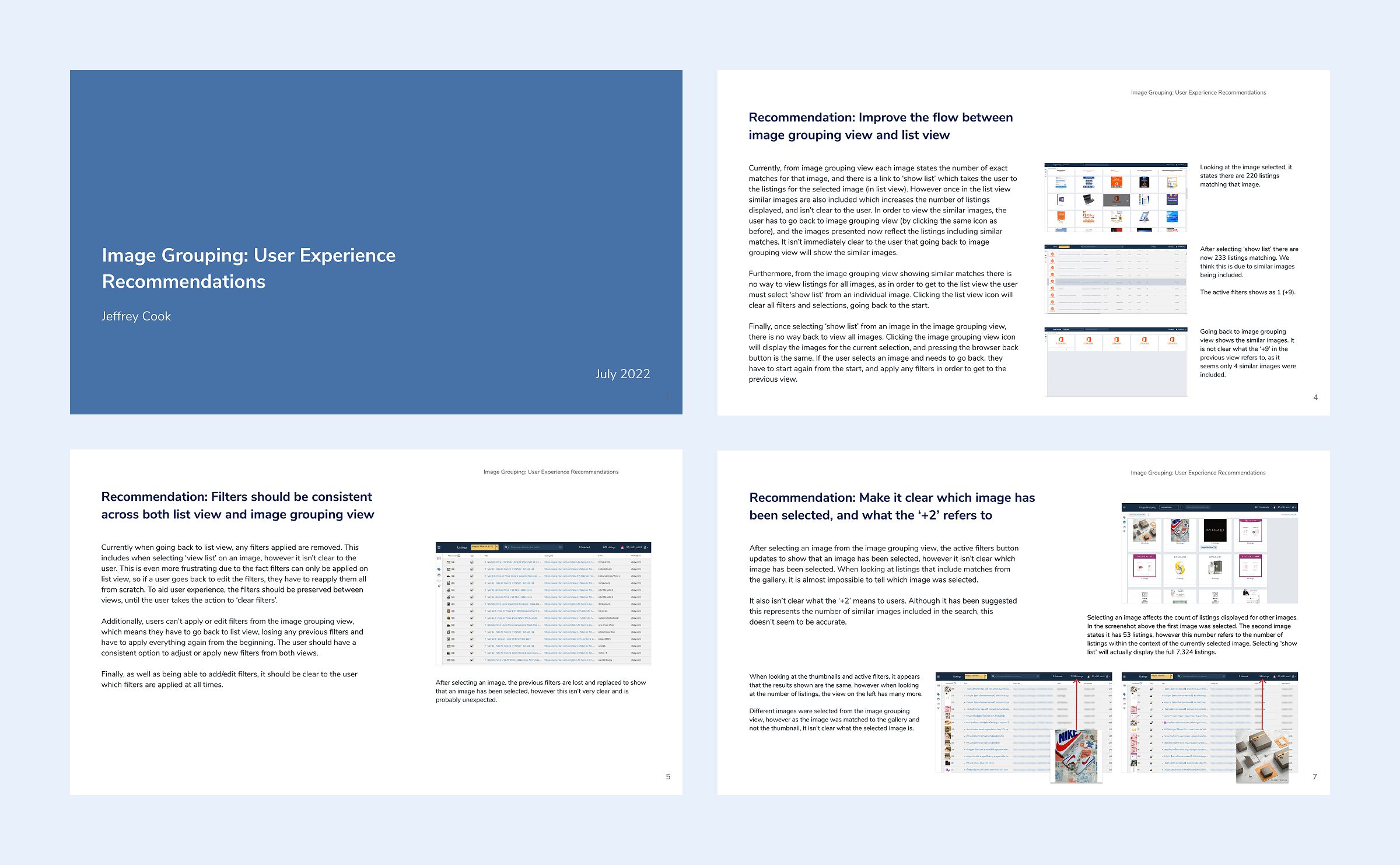
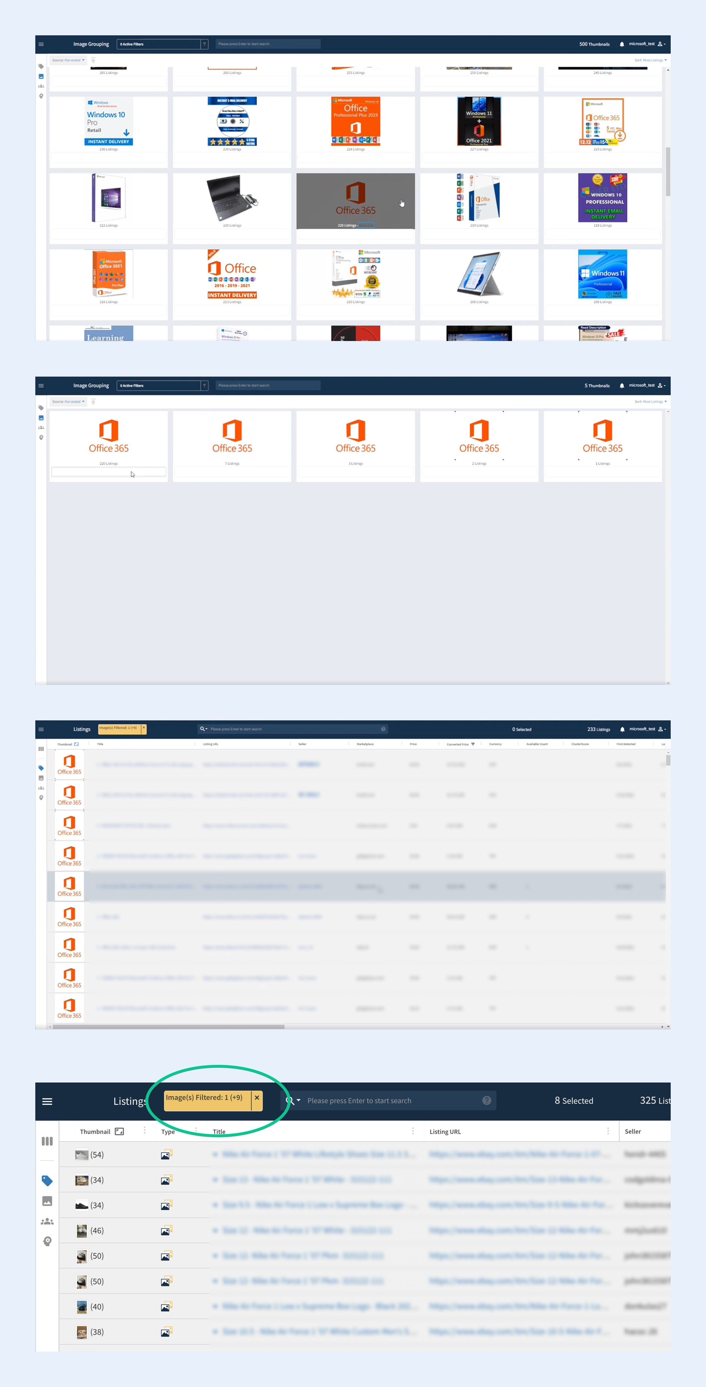
My review identified various problem areas with the existing implementation. The workflow required users to change between viewing the product images and the corresponding listings, however navigating between them was unintuitive with no clear path back without starting from scratch. This was more evident when filters were applied, as they didn’t persist between the different views, causing staff to reapply them every time they changed view.
The filters themselves also provided additional challenges, as although a limited set of filters existed, they were hidden behind a single button, meaning it was difficult to see which filters were applied at any time. When filtering by a specific image, there was nothing to show which image had been selected, and the relationship between exact matches and similar images wasn’t clear, leading to confusion especially considering the counts showing how many results had been found didn’t seem to line up either.
Wireframing
Turning findings into solutions
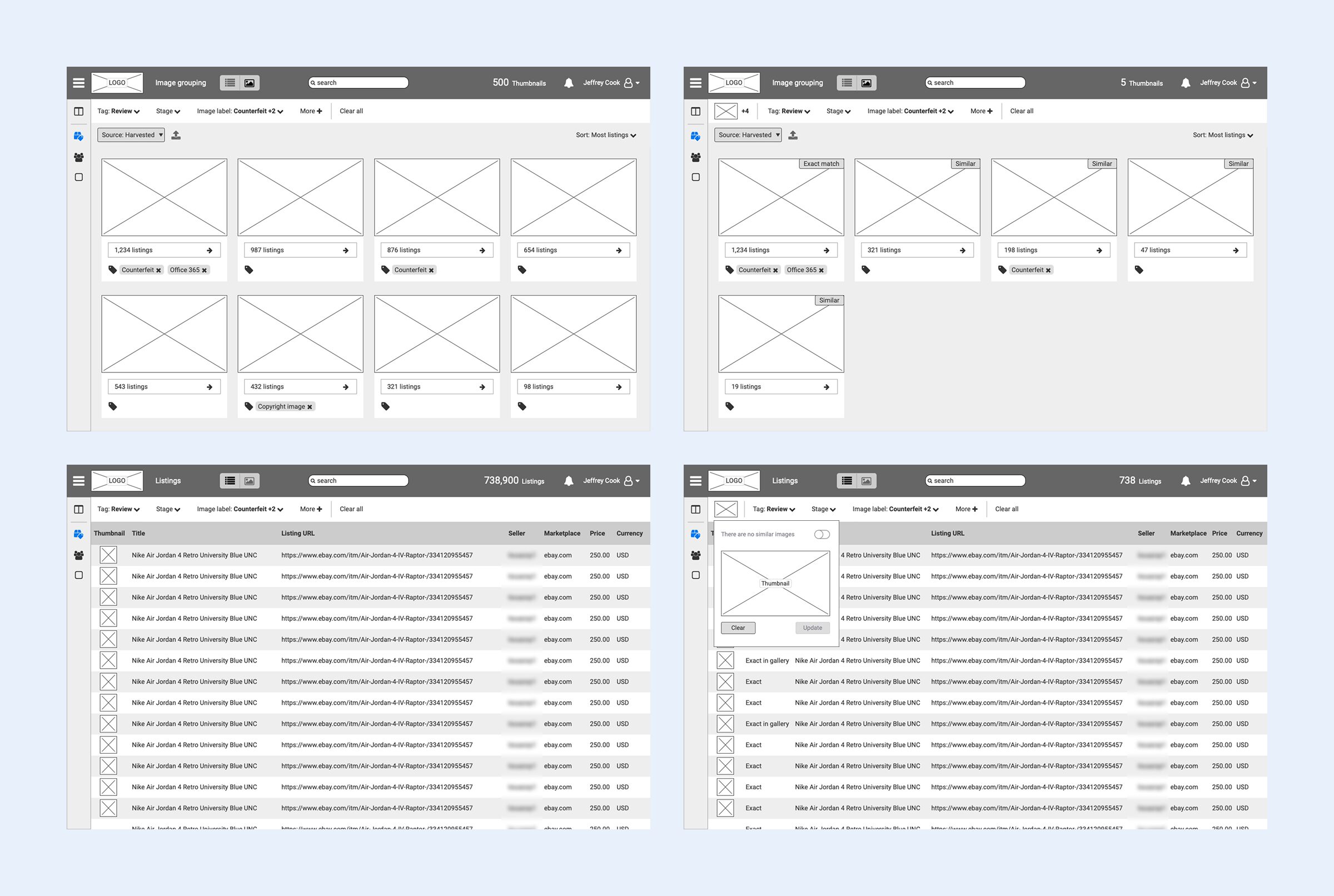
With a clear picture of the problem areas, I developed wireframes addressing each of the key issues identified in the review. Each proposed change was directly traceable back to a specific finding, ensuring the solutions proposed were based on the prior evaluation.
As well as allowing me to explore solutions quickly, the wireframes also served as a tool for validation, something tangible to put in front of real users before committing to high-fidelity designs.
Usability testing
Validating the wireframes with real users
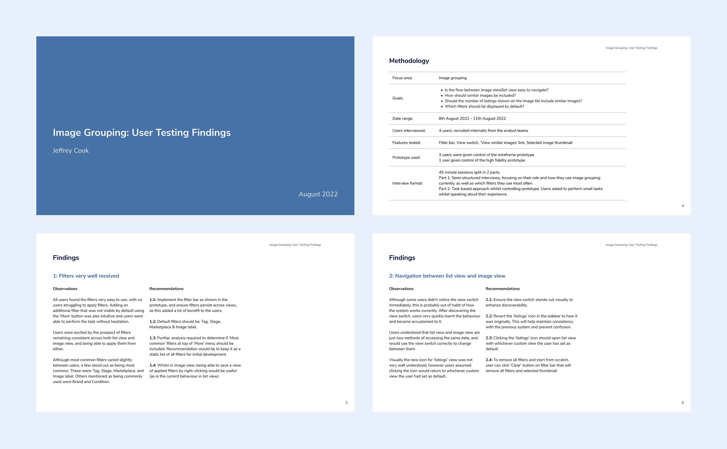
I conducted structured usability testing sessions with internal staff members who use the application in their daily work. Each session was split into two distinct parts:
Role & current usage: The first part of each session focused on understanding the participant’s role and how they currently use the application, establishing context and surfacing any additional pain points not yet captured in the initial review.
Hands-on prototype testing: The second part involved direct usability testing with the wireframe prototype. Participants were given control of the prototype and asked to perform specific actions while I observed for difficulties.
The feedback from the usability testing was very encouraging, but also highlighted a few areas for improvement, such as the view toggle occasionally being overlooked, and no clear way to quickly remove all filters. These were directly incorporated into the designs, and the positive feedback gave stakeholders confidence that the proposed changes would make a meaningful difference.
The solution
What changed and why
With the problem areas clearly defined, the designs focused on two main things: simplifying how users move through the feature, and ensuring they always have full visibility and control over what they’re seeing.
A unified view and simplified navigation
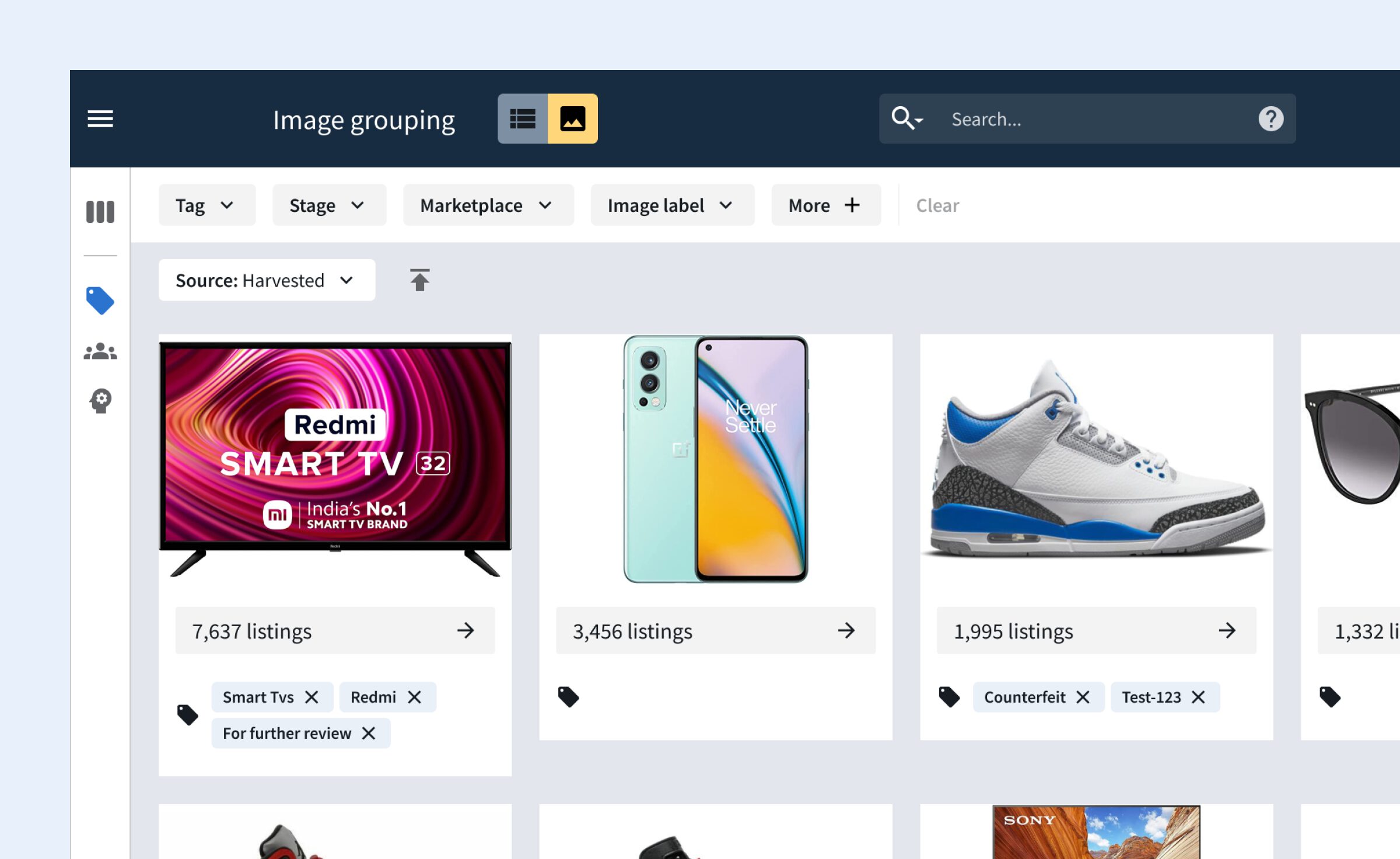
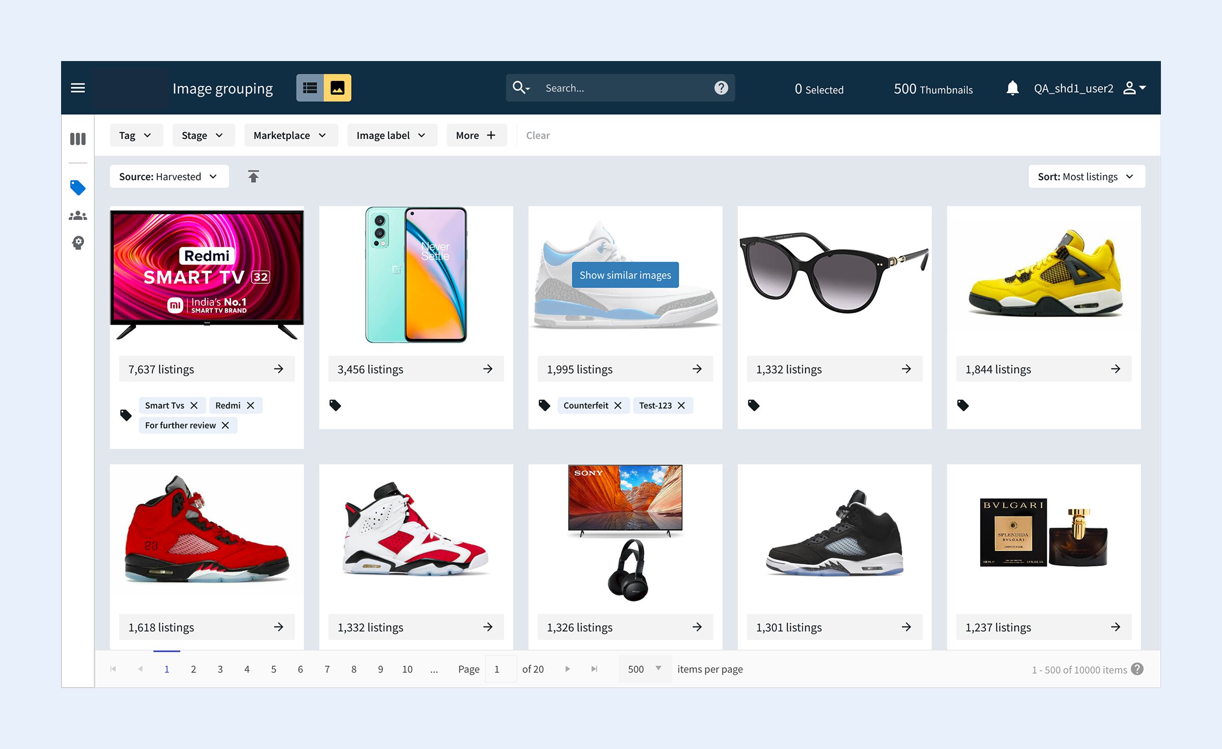
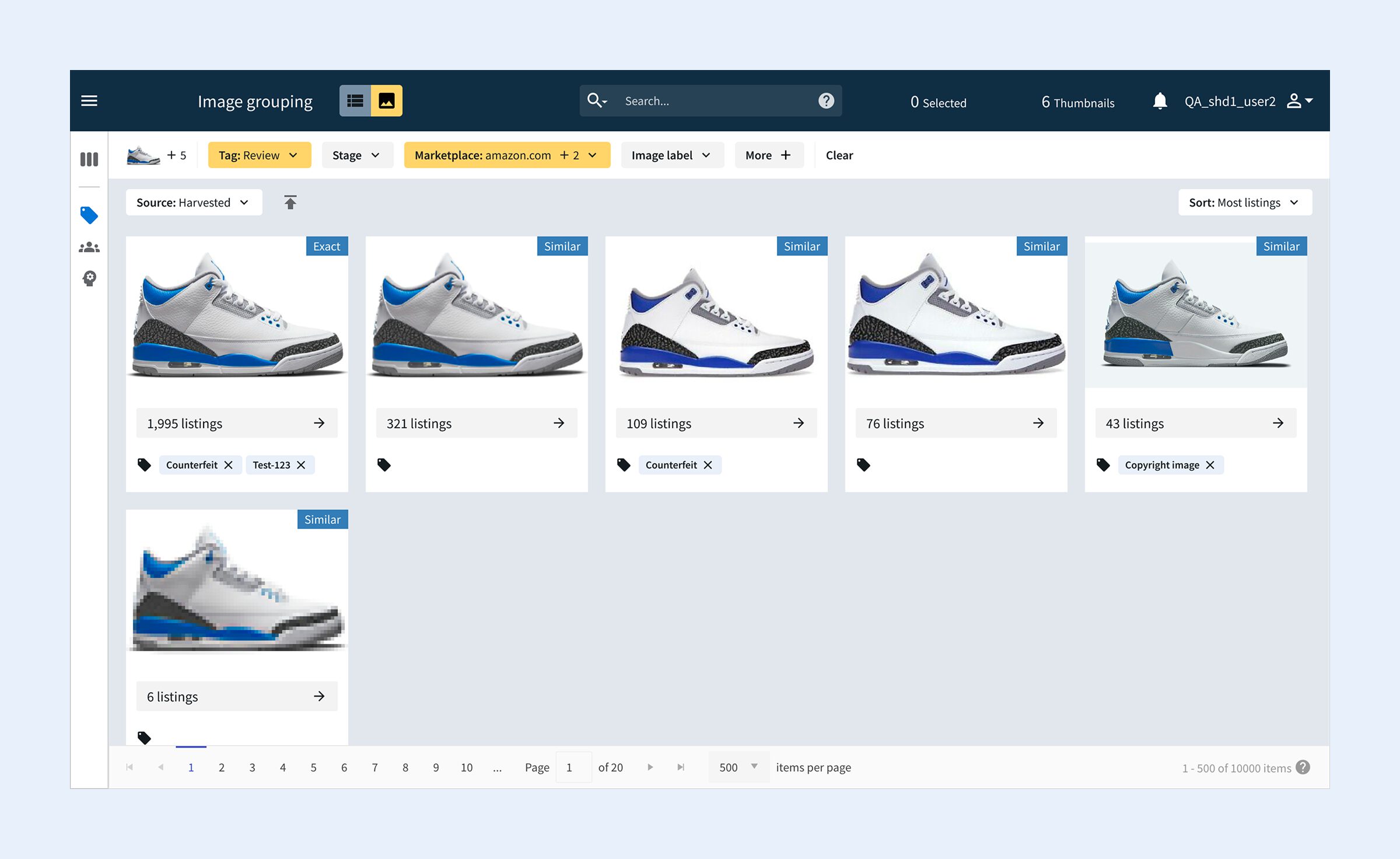
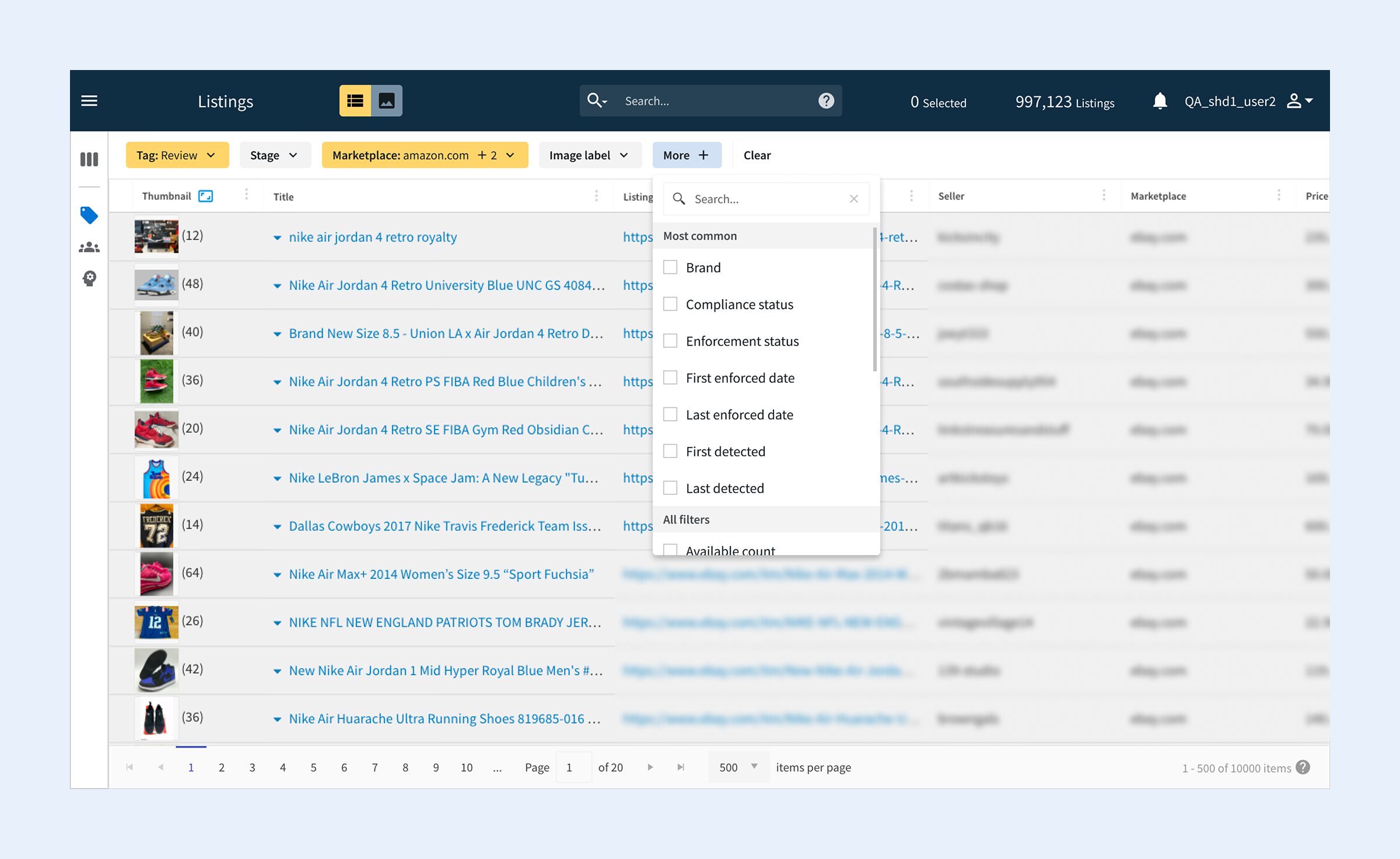
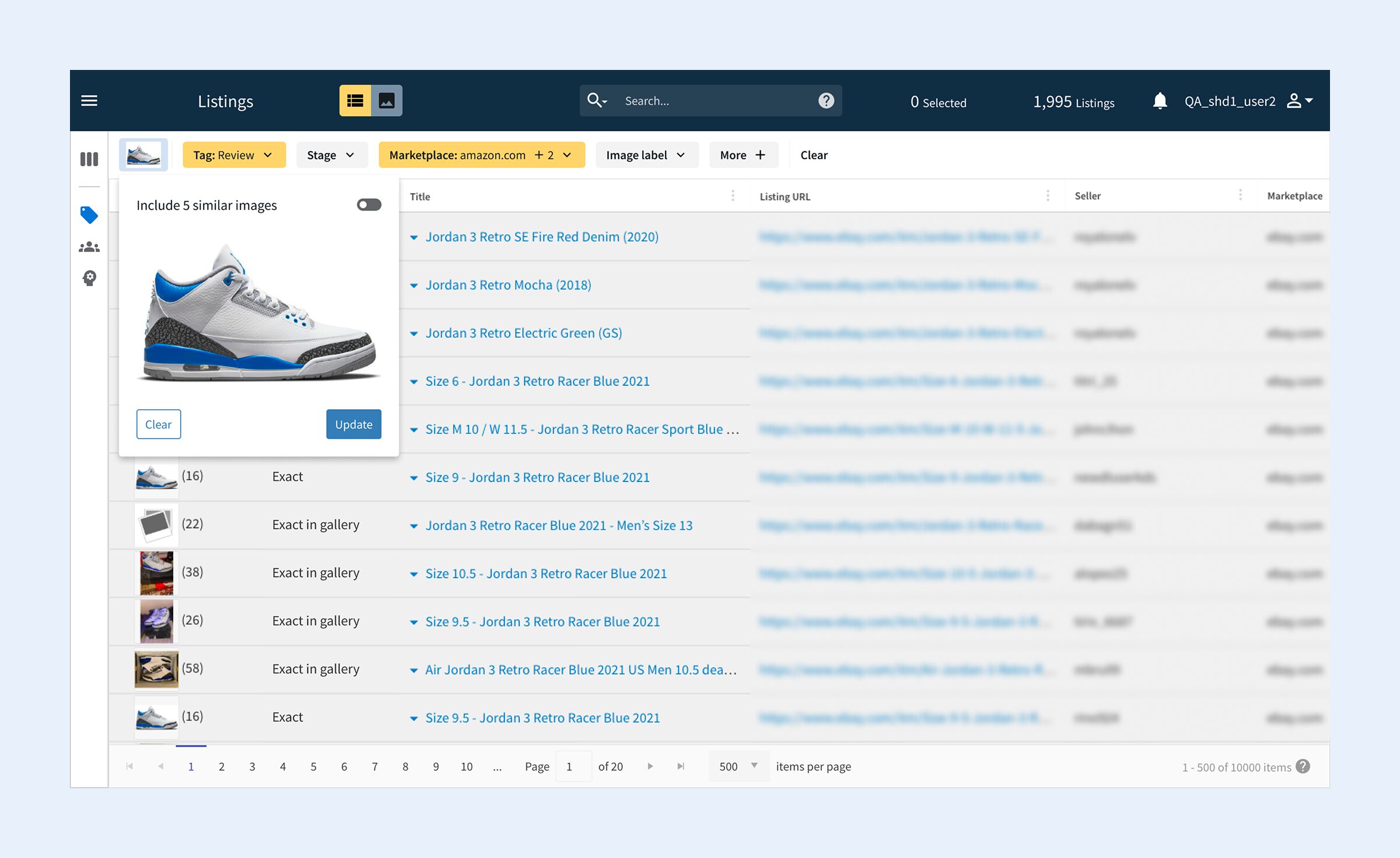
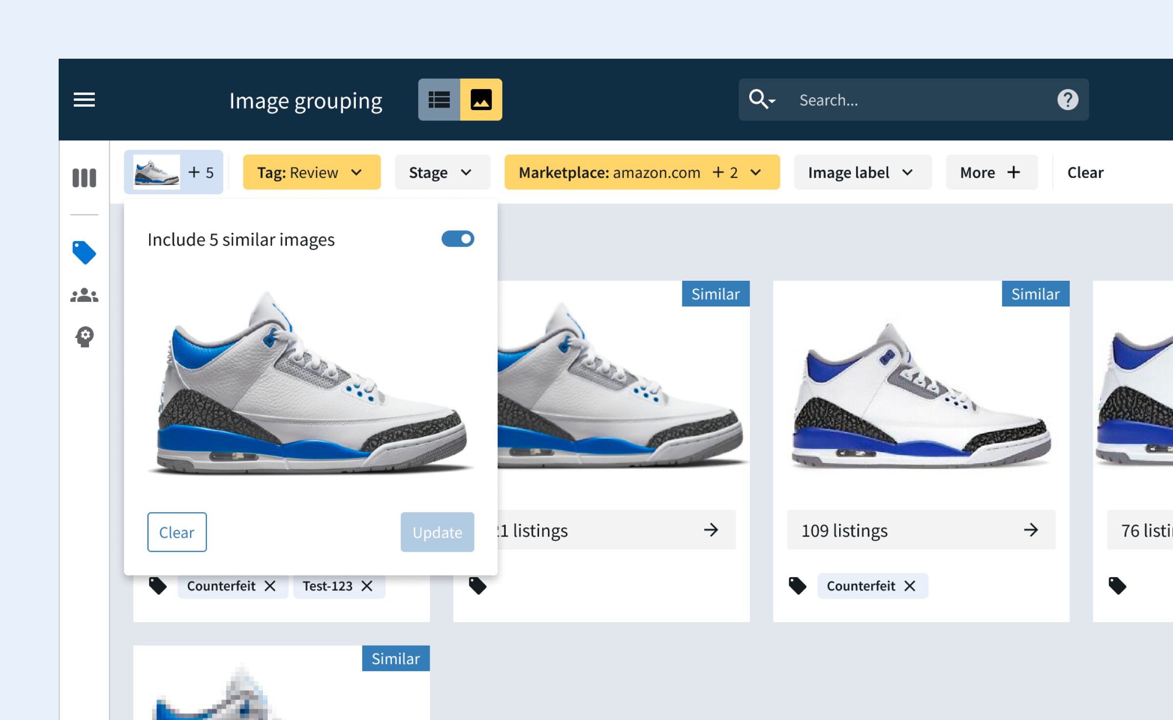
The two separate views were combined into a single unified interface, with a toggle allowing users to switch freely between image and list display — both representing the same data, just presented differently. A persistent filter bar remained visible and active across both views, eliminating the frustration of filters being lost every time the user switched. Each image also gained a dedicated “View similar images” button, giving users a clear and deliberate way to explore similar matches — and just as easy to remove without having to start again.
A persistent filter bar that's always visible
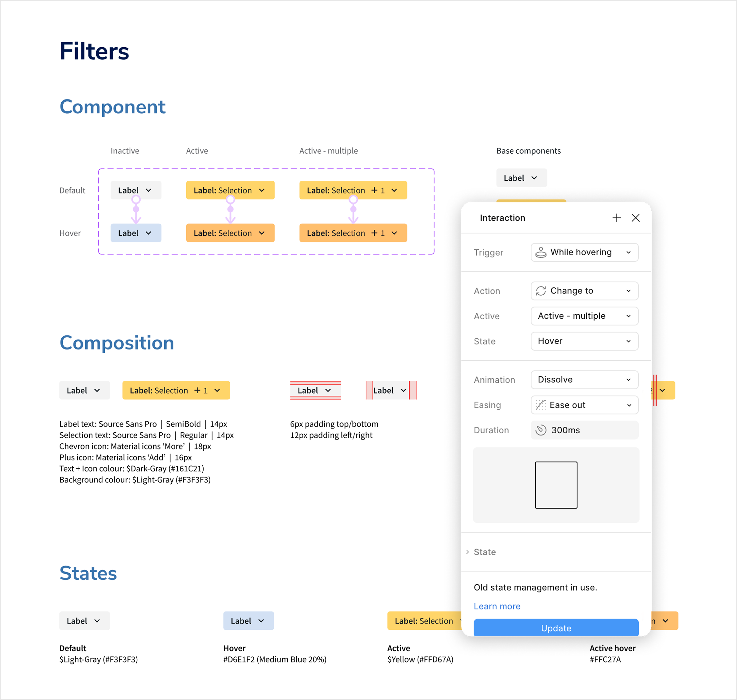
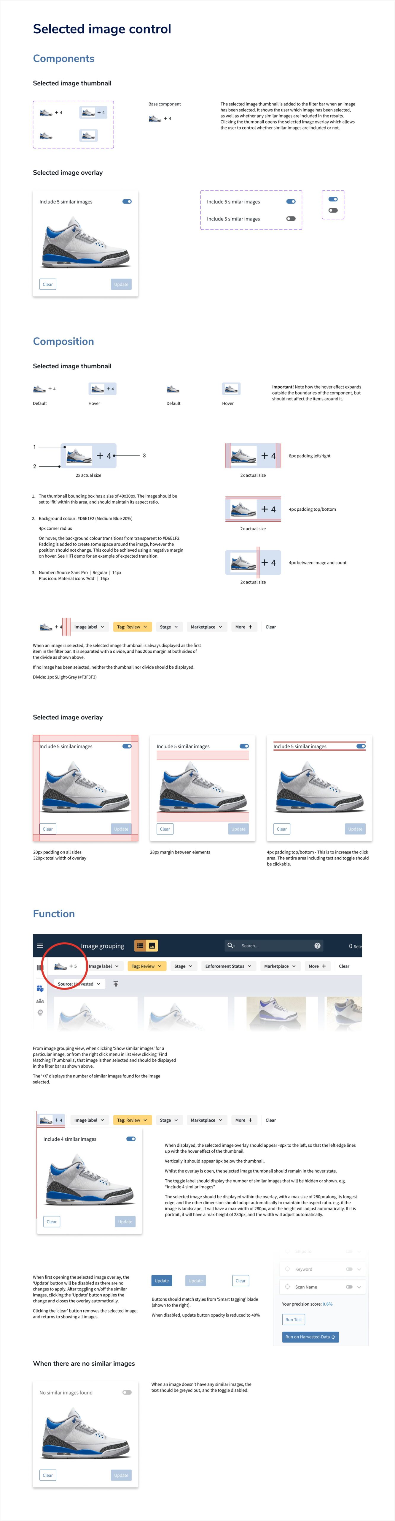
The new filter bar made it much clearer as to which filters were applied, as well as to add/remove filters and in the usability testing users found it incredibly intuitive to use. A thumbnail of the currently selected image, alongside a clear control for whether similar images were included or not, meant users always had full context at a glance. Counts were also aligned to always reflect the actual number of results in view, and with the clear signposting of whether similar images were included, it removed the ambiguity that had made the feature difficult to trust.
UI Design & handoff
A prototype that felt like the real thing
Every interaction within the redesigned feature was designed as a component, with all states accounted for — hover, active, error, empty, and more. This component-based approach ensured consistency across the entire feature, and meant nothing was left undefined for the development team to interpret.
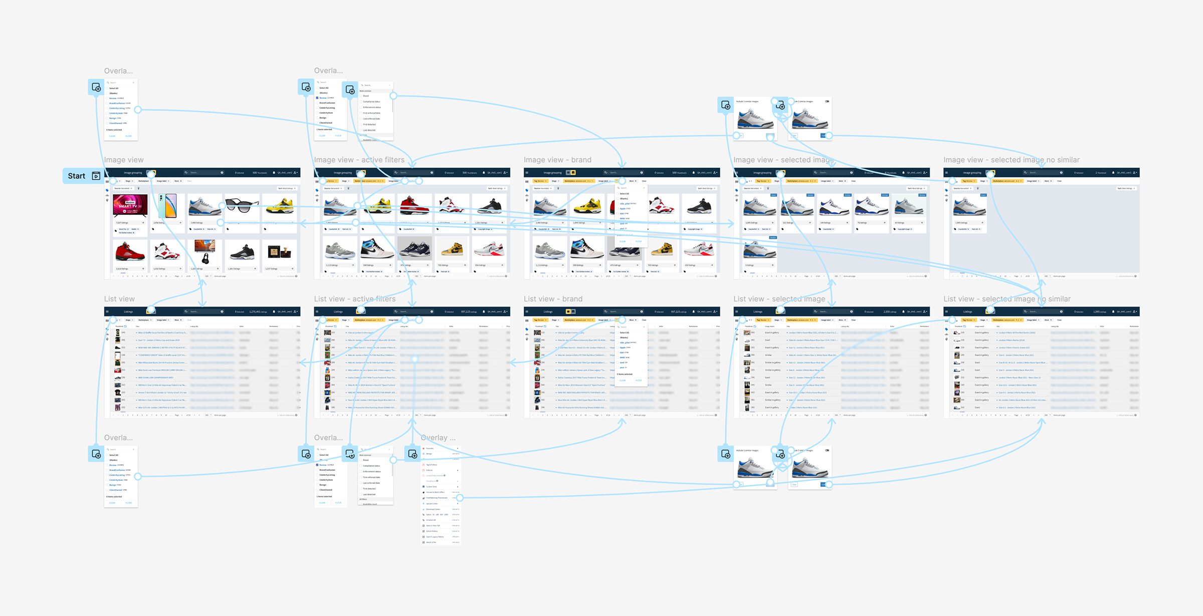
The final prototype went beyond static screens. By including the components I had created, the prototype inherited all the interactions. I wanted to ensure the prototype included examples of all the hover states, overlays, and complete multi-step flows to give stakeholders and the development team a genuine sense of how the redesigned feature would feel to use.
As development was due to begin after my contract ended, I also produced detailed design specifications for every component, outlining how each element should be constructed and how the interactions between screens should behave.
The outcome
A huge impact to their workflow
As development was implemented after my contract concluded, there are no post-launch metrics to report, however a common theme throughout the user interviews was that the feature in its previous state was not usable or too time consuming, and that the proposed changes would have a huge impact, making their workflow more efficient and even being something that could be presented to their clients.
Internal staff member — usability testing session
“With some of these improvements I think more clients can get into using this. It’s definitely a lot easier for us as CSMs to maybe present this to clients as a feature that is good and is useful.”